UberEvent
Background
This group project focused on identifying and solving major problems within the taxi app world. We discovered that group ride coordination, lack of transparency, and high costs were major user pain points. Our team designed and prototyped UberEvent within Uber’s existing system, collaborating from ideation to final design.
What I did
Research
Conceptualization
design
Timeline
8 weeks
Problem Statement
Problem Statement
Attending major events often means expensive and unpredictable transportation due to surge pricing, with ride-hailing costs rising by 79% in major cities. Events also cause heavy traffic and parking difficulties, leading to wasted time and increased carbon emissions, making the current system inefficient and unsustainable.
Research
-
High and Unpredictable Costs
A major concern among users is the expensive and inconsistent pricing of taxis and ride-hailing services, especially during peak hours . One user stated:
“I never know if my ride home will cost 50 or 150—it’s a gamble every time.”
Traffic & Parking Issues
Many avoid driving to crowded areas due to parking difficulties.
“Finding parking near a stadium is a nightmare.”
Lack of Cost Transparency
Riders struggle with unclear pricing, as final fares often exceed initial estimates due to demand or route changes.
“I wish the price was locked in.”
Limited Late-Night Alternatives
Public transport isn’t always available, leaving users with no choice but expensive rides. “After midnight, it’s either wait an hour for a bus or pay a fortune for an taxi.”
Convenience Over Cost
Despite high prices, users prefer taxis for their reliability and ease, avoiding the hassle of parking and schedules.
“At the end of the day, I just want to get home without thinking about buses.”
-
Two observations and 2 self experiences
-
As part of our research, we analyzed shared ride features in ride-hailing apps to understand how they address similar challenges. This helped us identify best practices and areas for improvement in Uber's shared ride feature.
We examined apps like Yango, Bolt and Lyft gaining key insights:
Clear Pricing Matters – Users prefer upfront pricing, as seen in Gett Share and Yango.
Predefined Pickup Points – Apps like Yango and Bolt improve efficiency by using fixed pickup locations.
-
Lior Levi
Age: 32
Profession: Market Analyst
Location: Tel Aviv
Pain Points:
• Unclear pricing
• High ride costs
• Parking shortage in his living area
• Unreliable arrival times
• Public transportion is inconvenient mostly at night
Goals:
• Transparent and predictable pricing
• Affordable ride options
• Easy access to social events
• No parking hassles
• Reliable and efficient rides
How Might We
Reduce the cost of taxi’s rides and provide cost transparency for users
The Solution
After brainstorming, we chose carpooling as the best way to reduce high fares. To address concerns about social comfort and rider matching, we designed a shared ride feature for events like concerts and sports games. By offering upfront pricing and group rides, Uber could help users save money, enjoy a better social experience, and increase driver earnings.
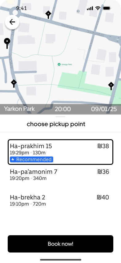
How it works
The final design features predefined pickup points (marked with a diamond), upfront pricing, and seamless integration into Uber’s interface. Users choose from three nearby pickup points, selected by GPS-based algorithms.

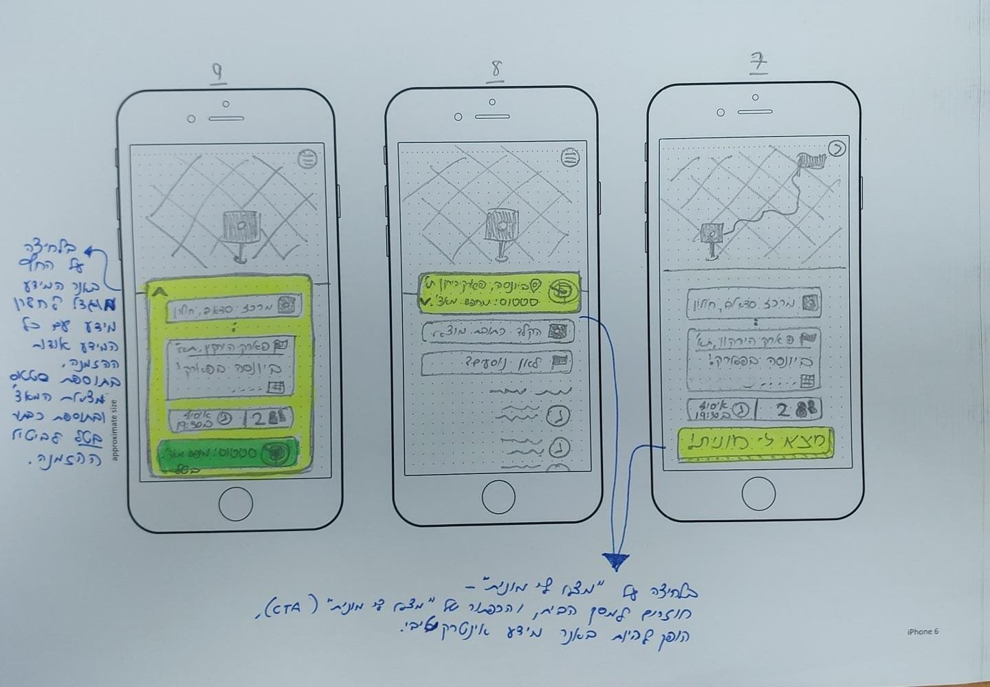
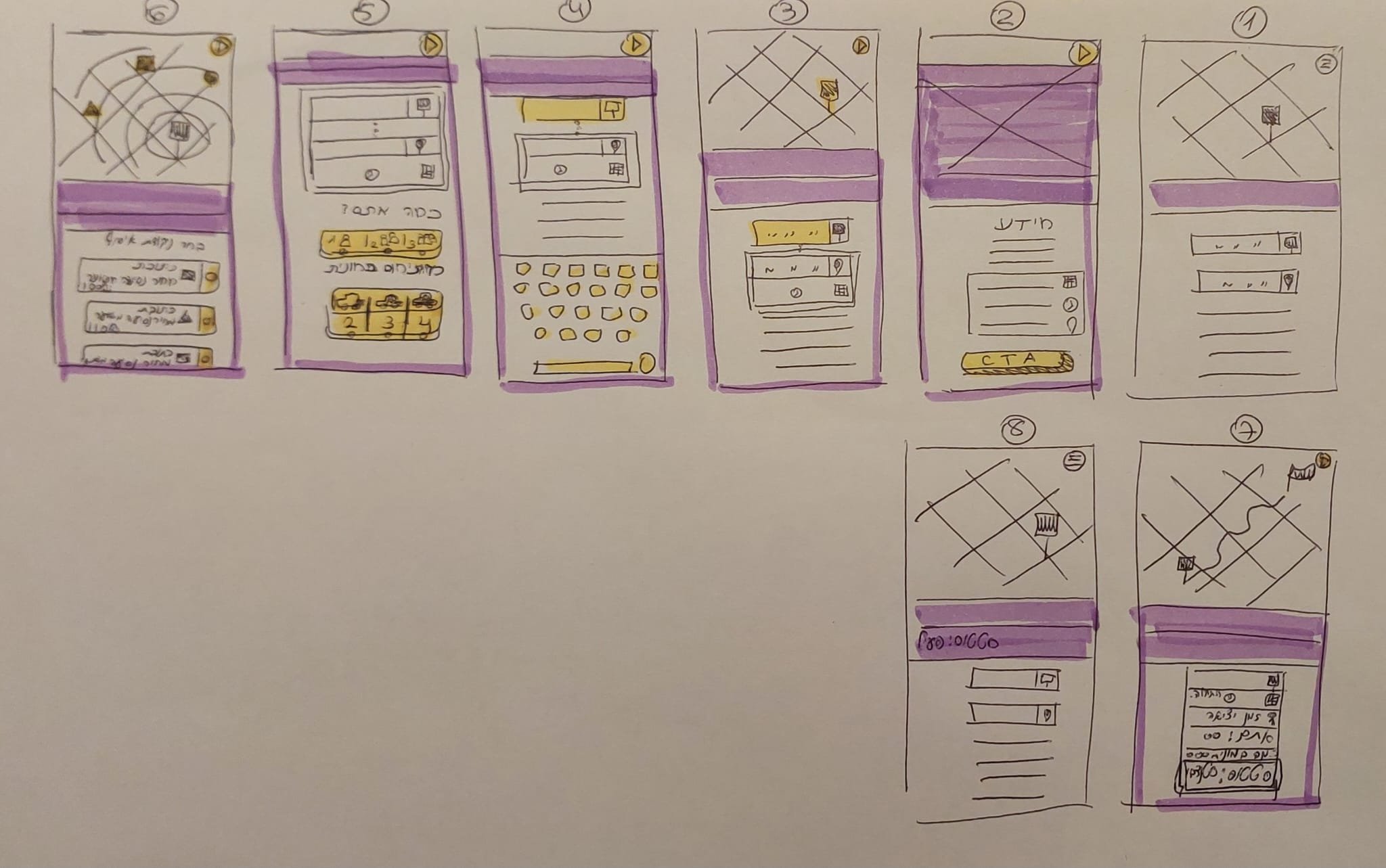
Prototype
Sketching
High fidelity wireframes

Pickup Point Clarity:
One challenge we faced was effectively communicating to users that they would need to go to the pickup point, rather than the taxi coming to them. This required clear visual cues and explanations to avoid confusion.
Pickup Point Clarity:
One challenge we faced was effectively communicating to users that they would need to go to the pickup point, rather than the taxi coming to them. This required clear visual cues and explanations to avoid confusion.
User testing
We conducted several rounds of guerrilla testing, initially testing two different app flows.
Based on feedback, we refined the flow and made adjustments to certain components that were confusing for users:
Option A
The pick up points in a separate screen
Option B
The pick up points appears at the same screen with current location and the final stop


Option A
Presented as a Banner
Option B
Presented as part of the suggestion's options


UI decisions based on Uber’s design system
