mashlom.me
Mashlom.me – Lab Test Feature (Mobile & Desktop)
Volunteer UX Project | 2025
Visit Platform
Mashlom.me is a nonprofit platform designed to simplify medical workflows for doctors across Israel. As part of this mission, I volunteered as a UX/UI designer to lead the design of the following feature: a digital system that helps doctors identify which test tubes to use for specific lab tests — a task that previously caused confusion and inefficiencies.
My Role
UX Research & Wireframing
UI Design & Visual Language
Icon Design
Mobile & Responsive Design in Figma
The Process
Collaborated closely with the lead developer (also a co-founder) and a product design colleague
The developer met with doctors from multiple hospitals to gather detailed insights and requirements based on real clinical workflows
These doctor interviews informed the content structure and functional priorities
I translated the findings into wireframes, then designed a clean and accessible UI in Figma for both mobile and desktop
Designed a set of icons to visually support lab test categories and improve scanning speed
The final design was introduced to doctors for review and feedback, which helped us fine-tune the experience before going live
UX Dilemmas & Design Decisions
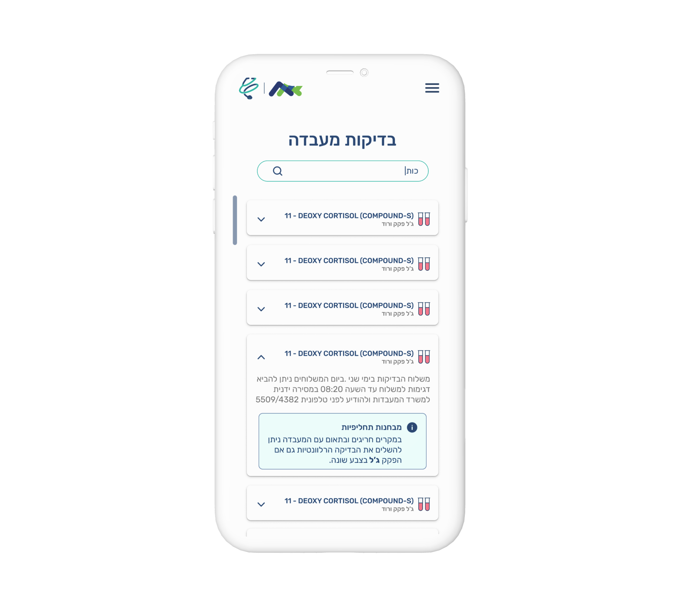
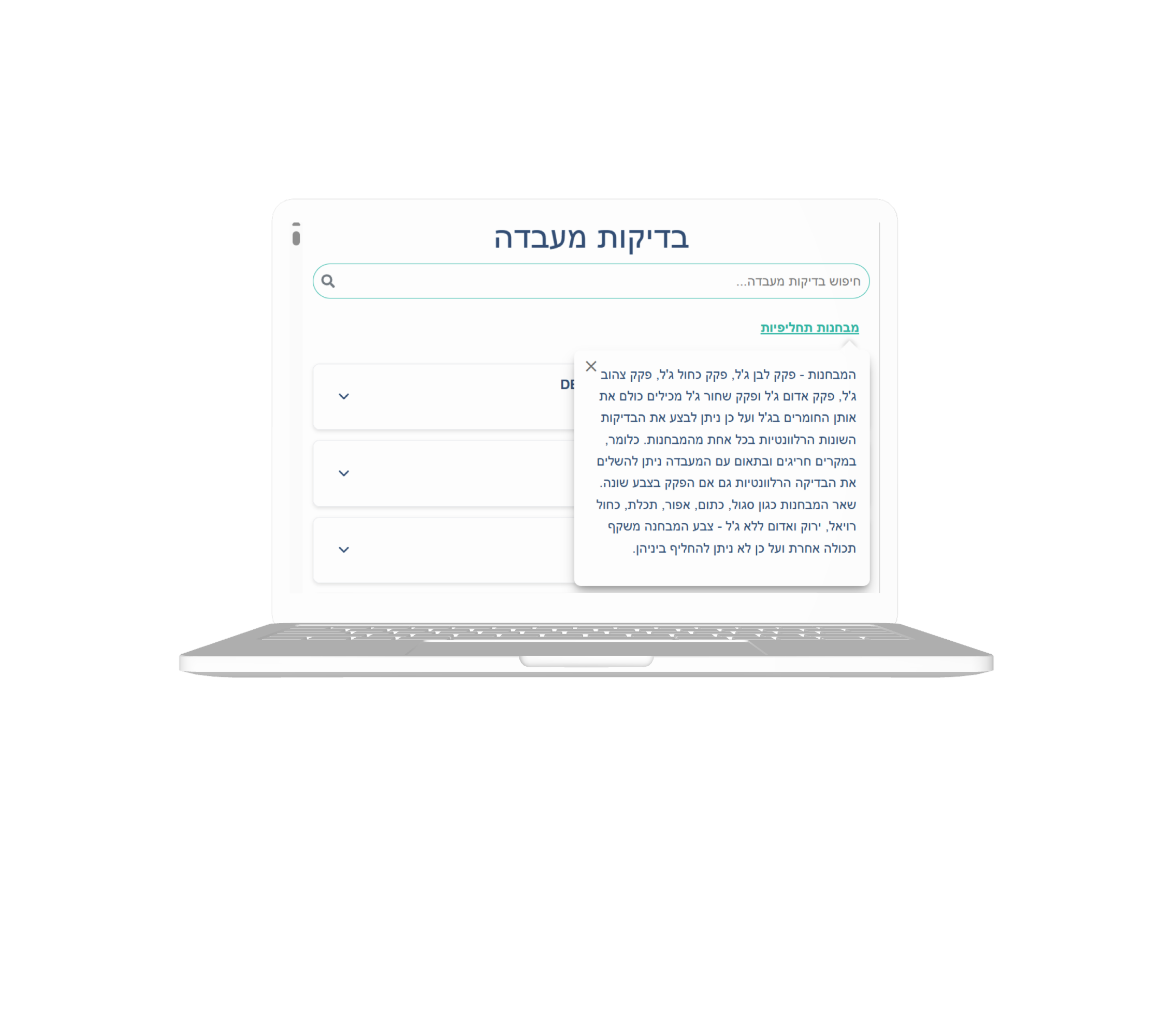
During the design of the Lab Test feature for the Mashlom.me platform, one of the key challenges we faced involved deciding where to place the information about substitute test tubes — a small but critical detail for doctors when the original test tube is unavailable.
Dilemma: Where to Display Substitute Tube Instructions
The Problem:
Doctors occasionally need to use substitute tubes when the recommended one is unavailable. We had to decide whether to show substitute tube information:
Inside each individual lab test section — keeping it context-specific and tightly linked to the test
At the top of the screen — making the substitute policy visible upfront and easy to find for anyone scanning the list
Our Design Discussion:
Placing the substitute information within each test would make the instructions precise but could lead to redundancy and visual clutter
Placing it at the top would make it more accessible and noticeable, especially for experienced users who already understand the context of each test
Our Solution:
We chose to place the substitute test tube explanation at the top of the interface, in a dedicated expandable info box. This approach ensured:
Doctors could access the rule once and apply it across all tests
The test sections stayed clean, short, and scannable
Mobile users didn’t have to scroll repeatedly through long repeated content
To enhance clarity, we used clear iconography and visual separation (borders, text color) to signal that this information was general and not tied to any specific test.
This decision was informed by both design reasoning and real-world feedback from doctors during review sessions — they confirmed that a centralized explanation aligned better with their workflow and reduced cognitive load.

